Six graphs that led to the new Covid lockdown for England

Boris Johnson's chief medical officer and scientific adviser spelled out in stark detail the threat the NHS is under this winter as Covid surges across the England.
Showing a series of graphs during the live Downing Street press conference, Chris Whitty and Sir Patrick Vallance warned infections were rising, patients were filling hospital beds rapidly and deaths are expected to climb.
As a result, the prime minister announced a new set of stricter measures to lock down England from November 5 until December 2.
Here are six graphs that spurred Mr Johnson to take action.
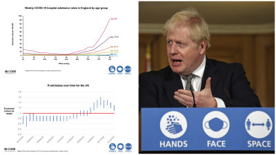
The R number has gone up
The R number remained relatively flat for some time.
When it is below the red line, the epidemic is shrinking - but above the red line it is growing.
From August onward, the R went above 1 and continues to grow.
While Tier measures have eased that growth, the fact the R has remained above 1 means the epidemic is still growing.
1 in 100 infected
An estimated 568,100 people within the community population in England had Covid-19 from October 17 to October 23. This equates to 1.04% of the population in England - or around 1 in 100 people.
The Office of National Statistics estimate there were around 9.52 new Covid-19 infections for every 10,000 people per day within the community population in England, equating to around 51,900 new cases per day.
Increase in hospital admission
This graph shows those aged 85 and over have been particularly affected.
An increase across all regions
And hospital admissions are on the increase across the regions in England.
Some hospitals even have more Covid patients than during the first wave
This graph shows have several hospitals (in red) have more patients with Covid-19 now than they did during the first wave.
It shows a steady progression or more and more patients with the virus admitted to hospital.
Hospital with more than 100 Covid patients are included in this graph.
Running out of acute beds
ITV News Political Editor Robert Peston described this graph as "the one big piece of new information".
On the left hand side is the impact on acute beds (for patients staying no more than 18 days) and ventilator beds on the right.
Projections showed peak bed usage could be exceeded later in November. In December, the NHS would reach the point where doctors would be forced to "postpone things nobody wants to postpone", Sir Patrick said.
Shared with cabinet, this graph shows the NHS running out of acute beds and the cancellation of elective surgery, according to projections by early December.